Color Psychology in Home Design: How Your Palette Affects Mood, Stress, and Mental Wellbeing

Long before you consciously evaluate a space, your brain has already begun responding to its colors. Color psychology in home design is not a decorating instinct. It is a science.
What is color psychology in interior design? Color psychology is the study of how color influences human perception, emotion, mood, and behavior. In the context of home design, it examines how the colors in your living environment affect your nervous system, stress levels, focus, and overall mental wellbeing — often through processes that occur beneath conscious awareness.
Color is one of the most powerful — and often overlooked — tools in design. It influences how we perceive a room, how comfortable we feel, how much energy we carry through a space, and even how long we stay in it. Most people choose colors based on personal preference or current trends. But neuroscience suggests there is far more happening beneath the surface.
See how Soma Atelier uses color to design for emotional wellbeing
The question isn't whether color affects us. The question is how.
How Does Color Affect the Brain Before We Consciously Notice It?
Color processing begins almost instantly. As light enters the eye, specialized cells in the retina transmit information along two distinct pathways simultaneously: a rapid subcortical route through the amygdala — the brain's emotional processing center — and a slower cortical pathway responsible for conscious perception and meaning-making. This two-track system explains why a color can feel activating or calming before you've had time to decide how you feel about it.
Research by psychologist Andrew Elliot and his colleagues has documented consistent associations between specific colors and psychological functioning — including the effect of red on attention and performance, and the relationship between certain hues and approach versus avoidance behavior. These responses are shaped by both evolutionary biology and cultural context, which is why understanding color in design requires both the science and the space.
Which Colors Are Most Calming for a Home?
Blue is often associated with calmness, trust, stability, and focus. Lighter blues can evoke openness and relaxation; deeper blues create feelings of confidence and sophistication. Used thoughtfully, blue helps a room feel grounded and restorative — which is why it consistently performs well in bedrooms, bathrooms, and wellness spaces.
Green is perhaps the most naturally comforting color because it is deeply connected to nature — trees, plants, forests, landscapes. For thousands of years, green has signalled life, safety, and abundance. Many designers use green to create spaces that feel balanced, healthy, and restorative — an instinct now supported by biophilic design research.
Which Colors Create Energy and Warmth in a Room?
Red is associated with energy, urgency, passion, and attention. It increases visual alertness and naturally draws the eye. In moderation, red can create excitement and warmth — in excess, it may feel overwhelming. It is best used as an accent rather than a primary palette.
Orange combines the energy of red with the friendliness of yellow, often feeling social, welcoming, and optimistic. It works well in gathering spaces, fitness environments, and creative settings — rooms where activation and connection are the purpose.
What Colors Support Focus and Cognitive Performance?
Soft neutrals — warm whites, soft taupes, natural beiges, and muted grays — create a visual backdrop that allows the brain to relax. They reduce cognitive load by not competing for attention. The eye has room to rest, and the mind follows.
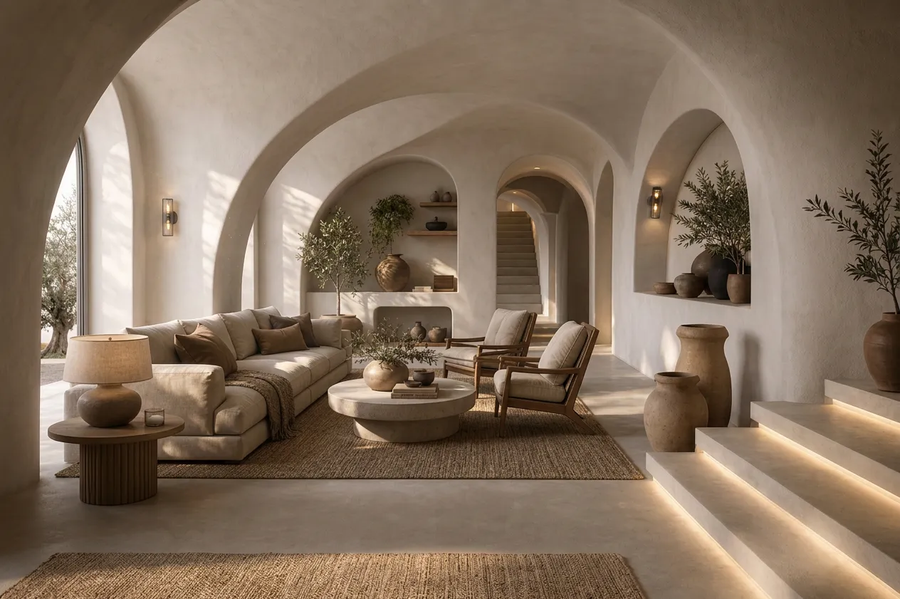
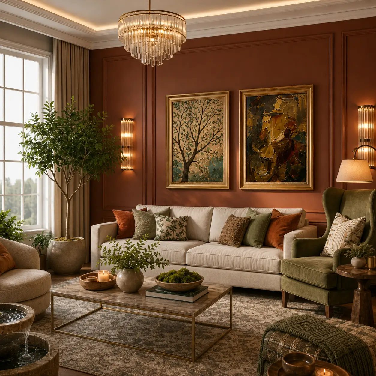
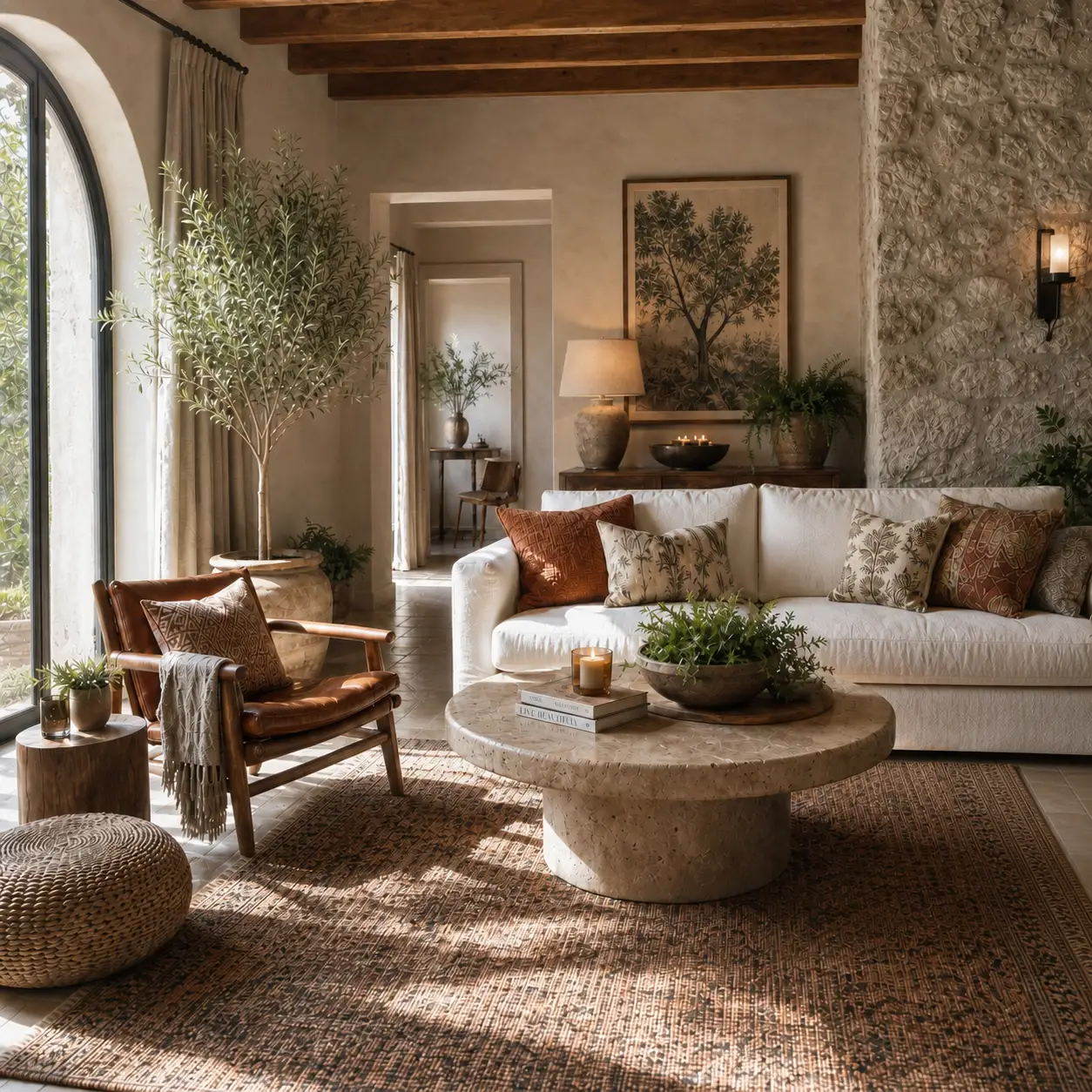
Earth tones inspired by natural materials — clay, sand, stone, wood, and soil — often create a sense of comfort and familiarity. These tones tend to feel timeless because they are rooted in nature rather than trend cycles. They reduce nervous system arousal without creating the flatness of pure whites or grays.
Why Following Color Trends Can Work Against You
One of the most common mistakes homeowners make is choosing colors because they are fashionable rather than because they support the purpose of a room. A color that looks stunning on social media may feel completely different when you live with it every day — because color response is cumulative and contextual, not just visual.
The wrong question: "What color is trending right now?" The better question: "How do I want this room to make people feel?"
Every room serves a purpose. A bedroom should encourage rest. A home office should support focus. A dining room should encourage connection. A wellness space should promote calm. Color becomes most powerful when it aligns with the experience you want to create.
Color is not decoration. Color is communication.
Frequently asked questions
What is color psychology in interior design?
Color psychology in interior design is the application of research on how color affects human perception, emotion, and behavior to the design of living and working spaces. It moves color selection beyond personal taste or trend, using an understanding of how different hues affect the nervous system, mood, and cognitive performance to make spaces that serve their occupants' wellbeing.
What are the most calming colors for a home?
The most consistently calming colors in home design are soft blues, sage and muted greens, warm whites, and earth-based neutrals such as clay, taupe, and warm beige. These colors reduce visual stress, lower nervous system arousal, and are associated with natural environments the brain is primed to find restful. Blue-greens and dusty sage are particularly effective in bedrooms and wellness spaces.
How does color affect mood in a room?
Color affects mood through both biological and psychological pathways. Biologically, color information travels through the eye to brain regions involved in emotional processing — including the amygdala — before reaching conscious awareness. Psychologically, we carry learned associations with colors shaped by nature, culture, and experience. The result is that color can shift a room's emotional register measurably, affecting how calm, energized, focused, or comfortable we feel inside it.
What paint colors are best for a bedroom?
For a bedroom — a space whose primary function is rest and restoration — the most effective colors are soft blues, muted blue-greens, pale sage, warm white, and soft taupe. These signal calm, reduce visual arousal, and align with the body's need to down-regulate for sleep. Bold, saturated, or warm-dominant colors like red, bright orange, or vivid yellow are generally better suited to more active spaces.
Can paint color affect mental health at home?
Yes — while paint color alone is not a mental health intervention, research consistently shows that color is one of several environmental factors that influence mood, stress, and wellbeing. Living in spaces whose color choices create persistent low-level stimulation can contribute to cumulative stress over time. Color choices aligned with a room's emotional purpose can meaningfully support the people living there day after day.